Case study — brand identity design
EOS³ — one identity that survives every surface
An End of Summer event brand designed as a single vector system: avatar to apparel to large-format signage, without the logo being redrawn each time it moved to a new medium.
- Scope
- Logo system, palette, usage sheet, motion
- Deliverables
- AI, SVG, PDF, PNG, MP4
- Surfaces
- Social, print, apparel, signage, video
The mark
A monogram sized by its worst-case use
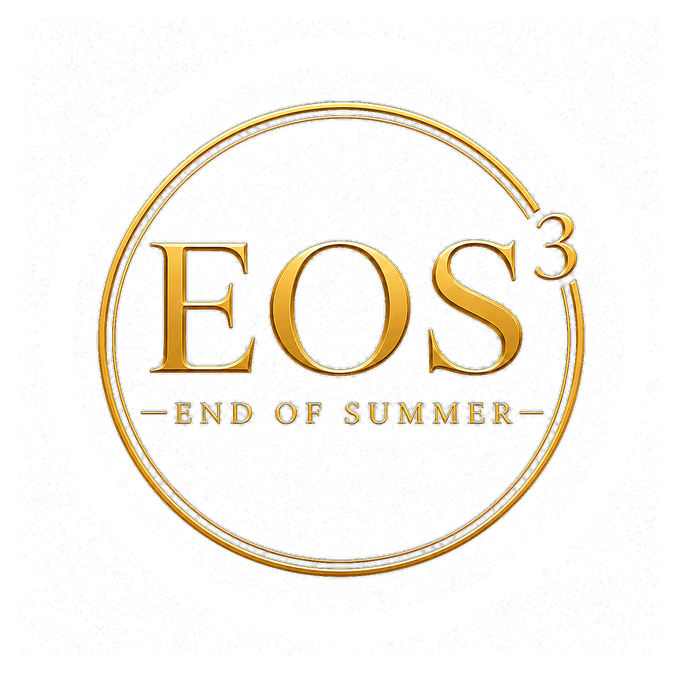
Most identities fail in the places nobody designs for: a 32-pixel avatar, a single-colour embroidery file, a vinyl banner seen from thirty feet. EOS³ was drawn backwards from those cases.
The result is a monogram with open counters, even weight and a numeral that reads as part of the mark rather than a footnote. Shrink it and it stays legible; enlarge it and nothing softens, because every edge is a vector path and not an exported bitmap.
The system
The full brand sheet
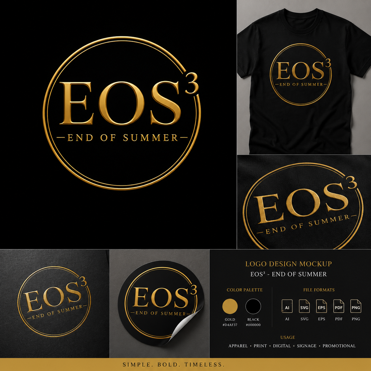
One sheet holds the primary mark, the wordmark lockup, the palette and the real-world applications — apparel, print, signage and promotional pieces — so anyone producing for the brand can see the intent without a phone call.
Process
How the identity was built
The same five stages run on every identity project I take, whether it is an event brand or a studio.
01
Define the constraint first
Before drawing anything, the hardest use decided the design: a mark that had to read at avatar size and embroidered on a garment. That ruled out fine hairlines, tight counters and gradients from the start.
02
Build the monogram as geometry
EOS³ was constructed from clean vector geometry — consistent stroke weights, aligned terminals, a superscript numeral sized against the cap height rather than dropped in as type.
03
Lock one colour relationship
A single gold on rich black. One relationship, reversible, with enough contrast to survive screen, press and thread. Fewer colours means fewer ways for a vendor to get it wrong.
04
Write the rules down
Clear-space, minimum size, approved backgrounds and the wordmark lockup, all on one usage sheet that ships with the files.
05
Extend into motion
The finished vectors became an animated intro and a motion invitation — the same geometry, moving, with nothing redrawn.
In motion
The identity, moving
Because the mark was vector from the first sketch, the animation is the artwork itself in motion — no tracing, no blur, no second version of the logo to keep in sync.