Spec project — animated brand identity
RIFT — a sneaker brand that moves before you do
A self-initiated identity for a fictional street-running label: logo, palette, motion and a poster campaign, designed as one system.
RIFT is a fictional brand created as a portfolio spec project.
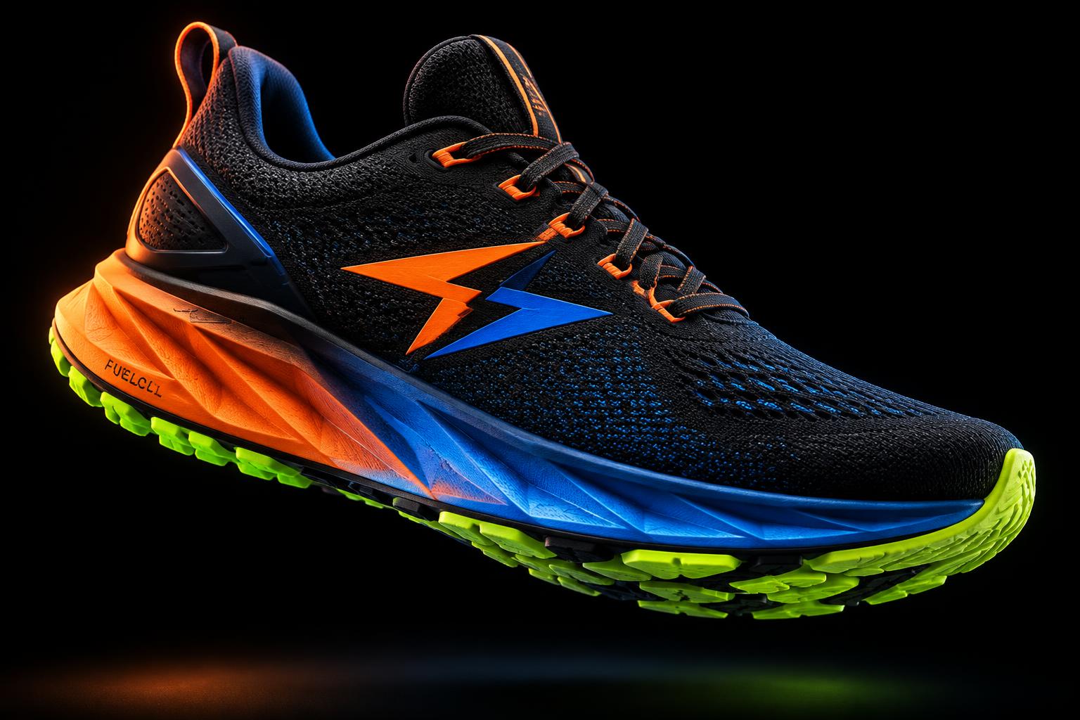
The product
The mark, on the shoe
Colour
Five colours, three of them loud
Volt Orange
#FF5A1F
Cobalt
#1F4BFF
Acid Lime
#D4FF2A
Night Ink
#0B0B0D
Court Paper
#F4F1EA
Campaign
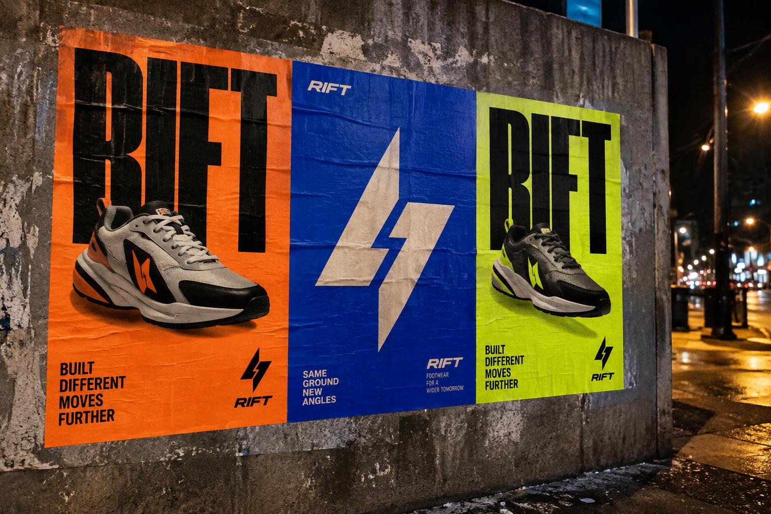
Out on the street
Process
How RIFT was built
01
The idea
RIFT is built on one thought: the same street, run from a new angle. The mark splits a lightning bolt into two shards that don't quite meet — motion caught mid-step.
02
The mark
Two parallelograms, one rotated 180° from the other. Simple enough to mould into a rubber heel tab, sharp enough to read at app-icon size.
03
The colour
Three loud colours on near-black. Orange for heat, cobalt for speed, lime for the night run. Any one of them can carry the brand alone.
04
The motion
The shards fly in from opposite corners, collide with a lime flash and a shockwave ring, then the wordmark slams in letter by letter.
05
The campaign
Wheatpaste posters, one colour per drop. The logo animation becomes the opener for every social clip and in-store screen.